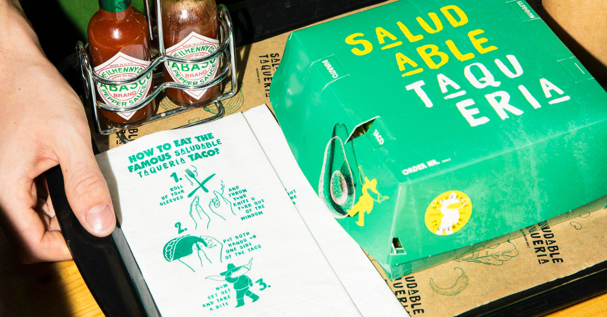
This is the brand identity of Saludable Taqueria

In this rebranding of Saludable Taqueria, we focused on integrating key values into the new brand identity. In the typography, illustrations and of color, for example. The font of the logo is handwritten where you get the feeling of craft and pure. The illustrations are the pure ingredients that Saludable Taqueria uses every day. The texture that gives depth again refers to the flour used to make the burritos. It is a positive, inviting and authentic branding.
About the brand
Saludable Taqueria is the Mexican restaurant with multiple locations in The Hague. The concept is simple: choose your base, choose your filling and choose your salsa and enjoy your personalized taco or burrito with pure and sustainable ingredients.
Curious about their branding and marketing strategy? Dive into Marc & Lester's story of how they evolved from visionary start-up to local favorite here.
Designed by:

Puck Milder
Graphic Designer
